Namastay Fitness & Wellness

CLIENT Namastay Fitness & Wellness

SERVICES Logo


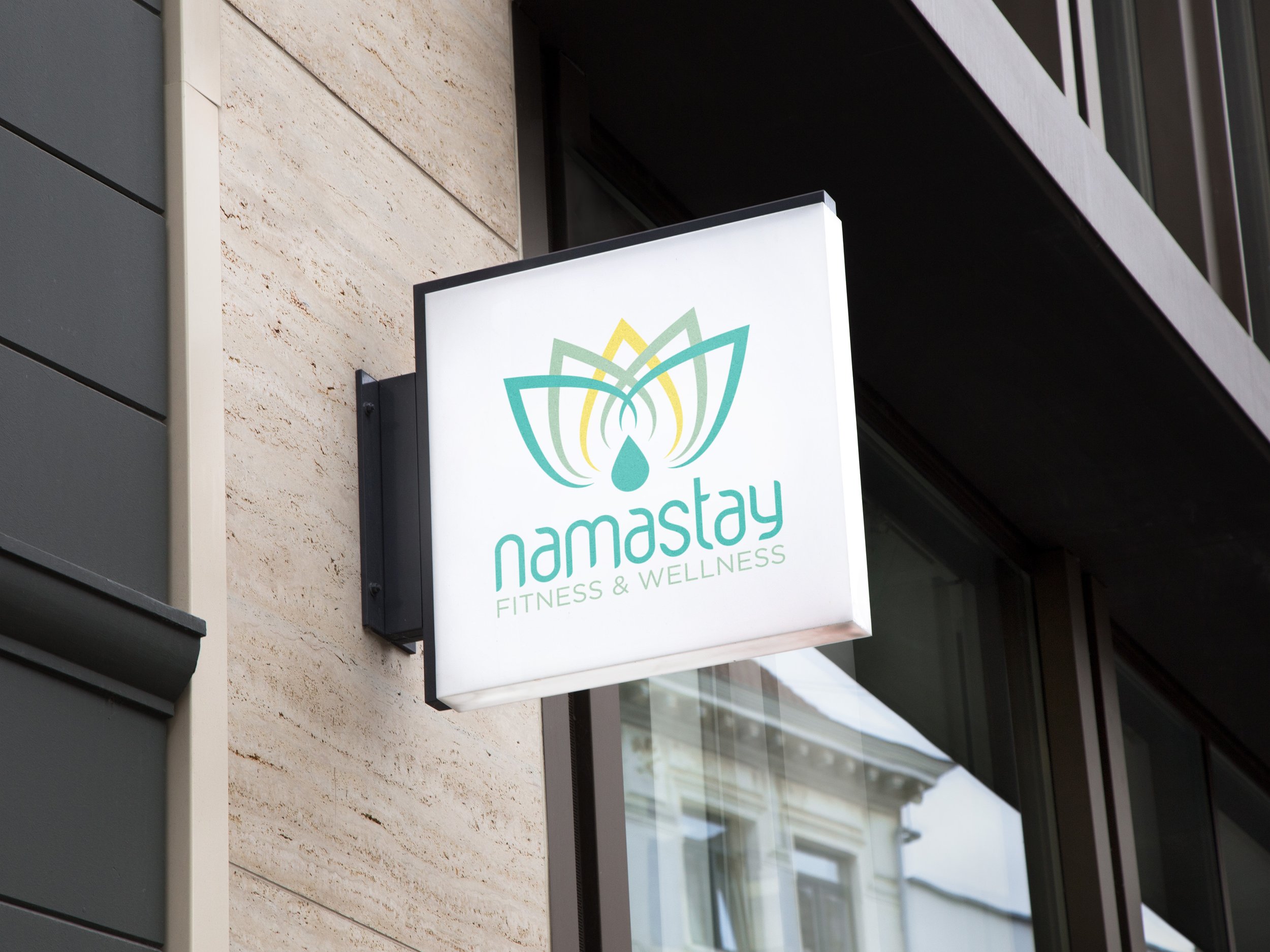
I worked with Namastay Fitness & Wellness on their logo for their massage therapy and massage technique teaching facility.


Challenge

  • Create a contemporary logo for an upcoming massage therapy and teaching facility

  • The logo must be engaging and calm as well as modern and not too obvious

Solution

The lotus flower is very popular among massage and yoga studios due to its symbolism of serenity; I created a more abstract version and stayed away from the usual pinks and purples one often sees associated with lotuses, choosing to propose teal, green, and yellow as the brand’s primary colors to both inspire a sense of peace in potential clients but also invigorate students with the bright yellow and engaging logo.

Amanda Fernandez

SAY HELLO TO AMANDA FERNANDEZ, an idealistic graphic designer hailing from the vibrant streets of Bridgeport, CT. With a lifelong passion for fine art, a collection of vintage poster designs, and an obsession with cult classic movie typography, she brings a unique perspective to the world of design.

Amanda’s signature style is a blend of vivid color palettes, crisp and commanding typography, and bold graphics. But her craft goes well beyond simple aesthetics and branding; it’s a tool used to empower small businesses and bolster the missions and values of larger enterprises dedicated to making positive changes in their community.

Having collaborated with an array of clients including local artists, restauranteurs, charities, and universities, Amanda has elevated their stories and helped them stake a claim in their communities.

https://fernandezzza.com
Previous
Previous

Milestone

Next
Next

Yale Peabody Museum of natural history