Oh Happy Honey

CLIENT Personal Project

SERVICES Logo • Packaging


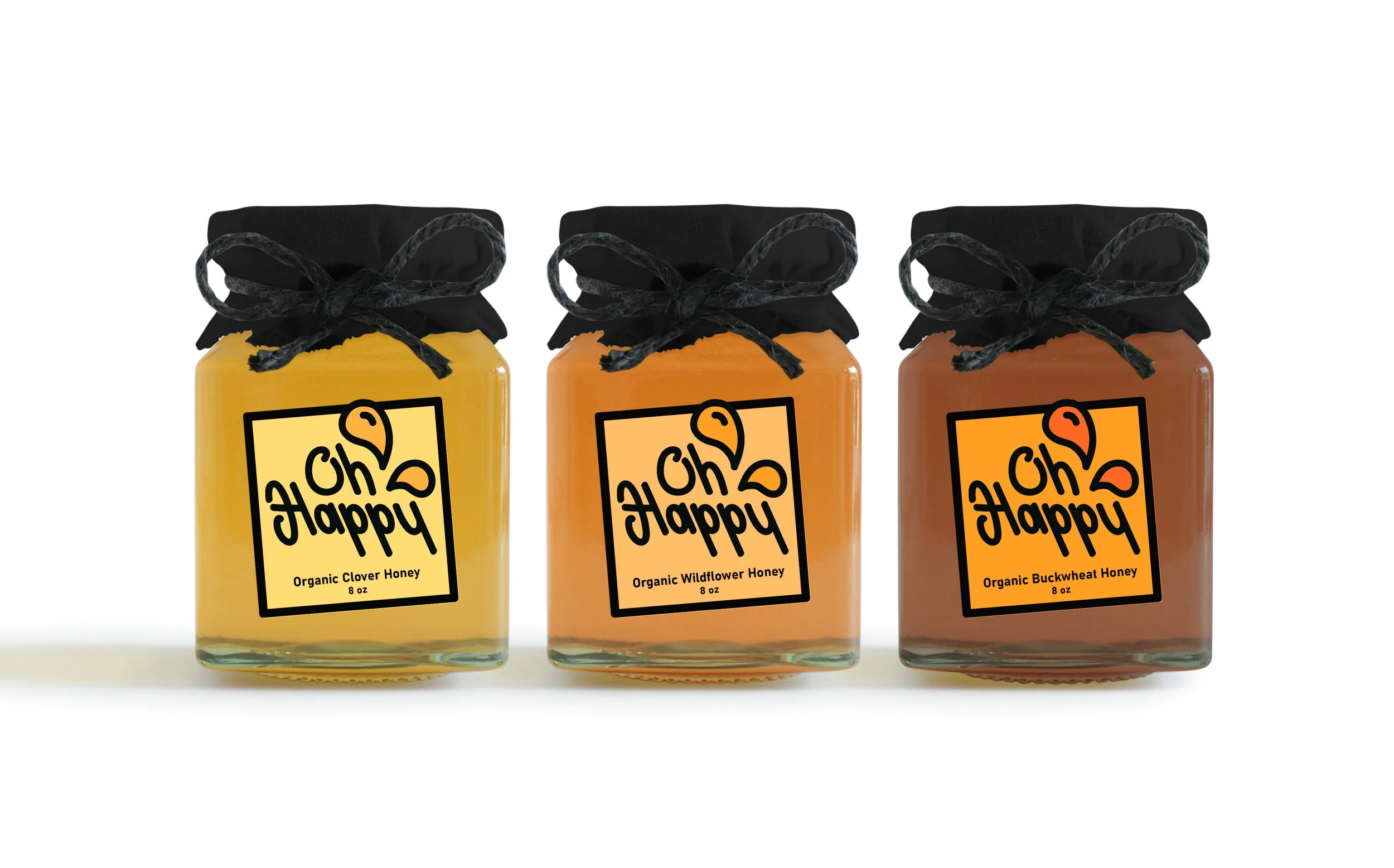
Oh Happy Honey is a fictitious package concept that I developed one day. I’d like to think Oh Happy is a very fun and ethical sort of brand, the sort that promotes saving the bees and utilizing every bit of the honeycomb effectively.


Challenge

  • Develop a packaging style that’s bold and memorable for a local honey brand, straying away from the usual nature aesthetics or more rustic, farmyard look.

Solution

The logo for Oh Happy is inspired by the idea of comic book panels, slightly askew with bold, blocky strokes and bits coming off the edges of the box. I wanted each type of honey to have it’s own color scheme, but kept them within the same warm, orange-ish hue for consistency.

Amanda Fernandez

SAY HELLO TO AMANDA FERNANDEZ, an idealistic graphic designer hailing from the vibrant streets of Bridgeport, CT. With a lifelong passion for fine art, a collection of vintage poster designs, and an obsession with cult classic movie typography, she brings a unique perspective to the world of design.

Amanda’s signature style is a blend of vivid color palettes, crisp and commanding typography, and bold graphics. But her craft goes well beyond simple aesthetics and branding; it’s a tool used to empower small businesses and bolster the missions and values of larger enterprises dedicated to making positive changes in their community.

Having collaborated with an array of clients including local artists, restauranteurs, charities, and universities, Amanda has elevated their stories and helped them stake a claim in their communities.

https://fernandezzza.com
Previous
Previous

Noodle Society

Next
Next

The Prescott Hotel