Zoya Caviar

CLIENT Personal Project

SERVICES Logo Design • Packaging


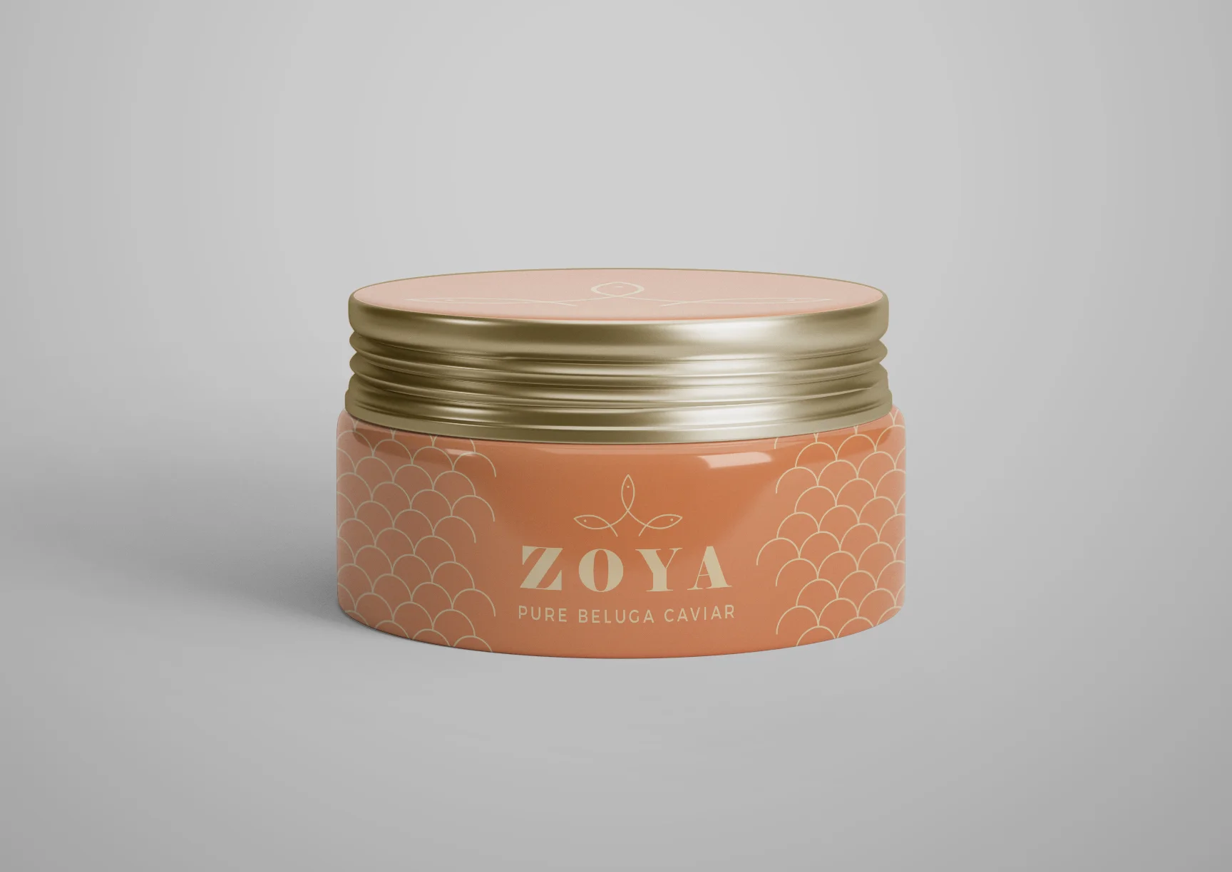
For the design of Zoya caviar, I shifted away from my signature style of large, bold graphic shapes and instead went with thin, sleek line art to emphasize the product's delicate and refined nature.


Challenge

  • Create a modern iconic logo that exuded both luxury and playfulness

  • Develop a color scheme that nods back to the product’s origins.

  • Craft a packaging design that was eye-catching and would make consumers want to try something new

Solution

Beluga caviar is black rather than the orange-gold of salmon caviar, but I felt that black and gold were overplayed in the high-end caviar industry. I wanted warmer tones that still felt luxurious and expensive and would look striking against black caviar, so I chose a lovely coral tone with a golden beige. The logo’s icon is a crown of fish, a nod to both the product’s origin and high quality.

Amanda Fernandez

SAY HELLO TO AMANDA FERNANDEZ, an idealistic graphic designer hailing from the vibrant streets of Bridgeport, CT. With a lifelong passion for fine art, a collection of vintage poster designs, and an obsession with cult classic movie typography, she brings a unique perspective to the world of design.

Amanda’s signature style is a blend of vivid color palettes, crisp and commanding typography, and bold graphics. But her craft goes well beyond simple aesthetics and branding; it’s a tool used to empower small businesses and bolster the missions and values of larger enterprises dedicated to making positive changes in their community.

Having collaborated with an array of clients including local artists, restauranteurs, charities, and universities, Amanda has elevated their stories and helped them stake a claim in their communities.

https://fernandezzza.com
Previous
Previous

Birds of a Feather

Next
Next

Amarilla